Storyboard arrows, and why they’re important
In the previous article we talked about storyboard basics, and we mentioned arrows as an important element of a storyboard.
What’s the point
If you ever saw a storyboard panel you’ve probably seen some arrows drawn around or over it. It’s pretty obvious what they mean, but just in case you’re wondering, let’s explain it.
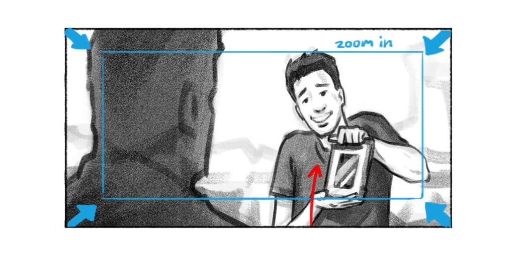
The point of arrows is to point (hehe) in the direction of camera movement or action movement. Basically, if you want to communicate that the camera, or someone in the scene is moving, you’ll draw arrows on that panel to indicate that movement.
By action movement, we think of either a character moving across the screen, character turning in space, moving just part of his body, pointing a finger or something similar.
Also, in many cases we’d write a few words next to arrow to describe in more detail what it represents.
But please, for the love of God, don’t ever write “camera pans down/up”. Remember, camera pans left or right, rotating camera up or down is called tilt. Trust me, your filmmaker/cameraman will appreciate it.

Read our previous article for more info about camera movements.
Important distinction
A vary important thing about the arrows is to differentiate camera movements from action movements.
You need to be very clear. Does your arrow imply camera should move towards the character or the character should move away from the camera?
Every storyboard artist draws arrows in their own way. Some draw 2D arrows, some draw 3D arrows, some draw thicker arrows, others draw thin arrows. You can do however you want it’s just important to draw your camera movements differently from your action arrows. One way you can do this is to make your camera arrows white, and your action arrows black.

One system I like to use is – blue color for camera arrows, red for action arrows
Conclusion
At the end of the day, the most important thing is to be consistent. You can try using different arrow systems and experiment with the ways you draw them. But, you must be consistent within one project.
Your client or director would be very confused if you used white arrows for camera movements in one scene, and black arrows in another scene. Be clear and consistent, so when someone looks at your boards they can easily understand what you’re communicating.
