Why every rule of art composition is WRONG
If you’re any type of artist, photographer, filmmaker, painter, storyboard artist, or similar, you’re making pictures all the time. Whenever you’re creating an image, you need to think about the placement of every element on that picture. And some placements just look more pleasing than others. That’s composition.
You’ve probably heard about some of the composition rules like the golden ratio, the rule of thirds, and the looking room. But they’re all wrong. Here’s why.
The Myth of the Golden Ratio
The Golden Ratio is one of the most famous compositions in art. You see these beautiful images with overlaid golden spirals that match perfectly all the time. Even if you look into nature, you’ll find this pattern everywhere. Flower seed heads, shells, galaxies, this pattern is everywhere, they even say that our DNA follows this ratio. And honestly, it looks beautiful, it’s like a magic number programmed into our universe that makes anything look nice.
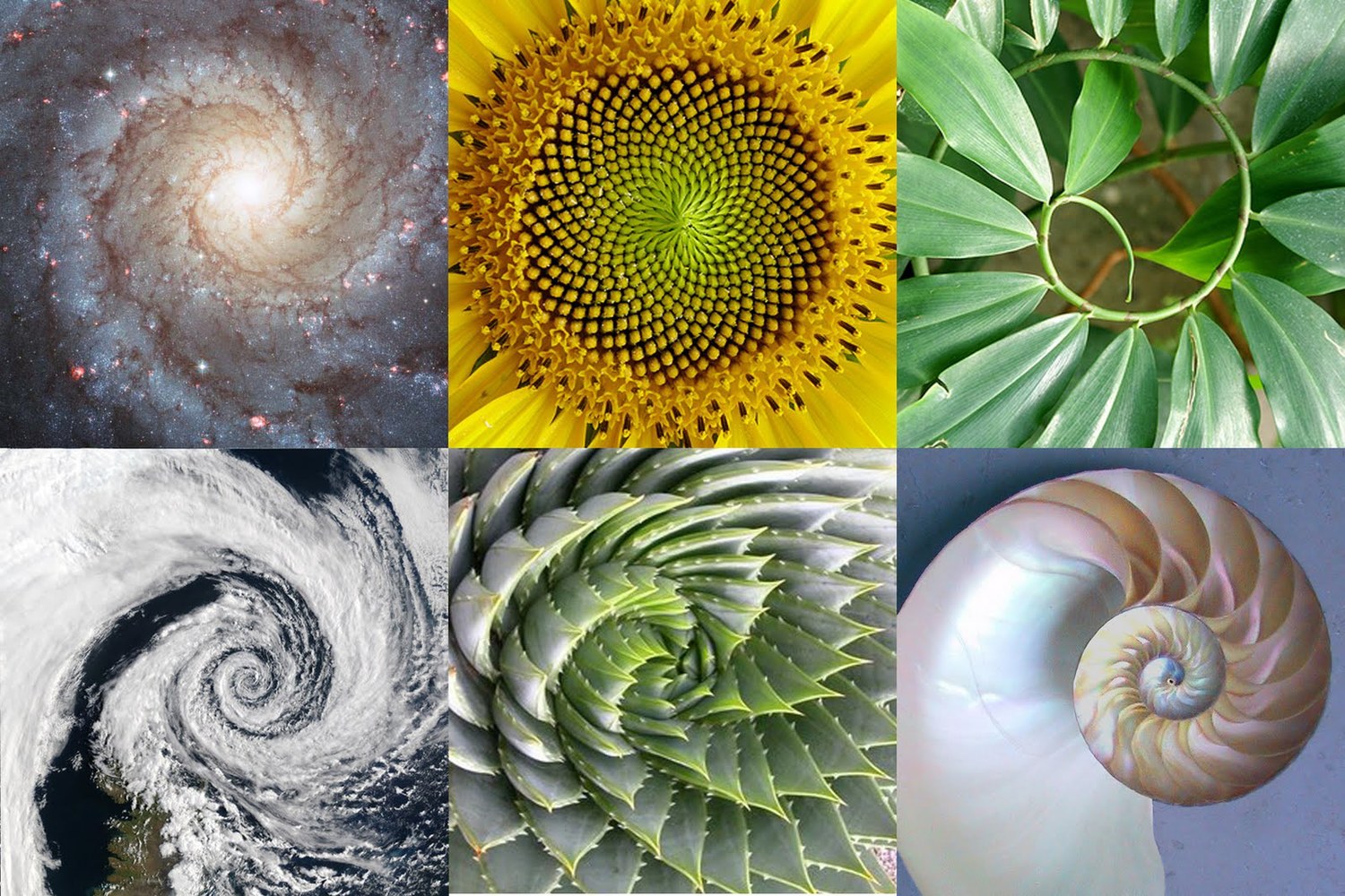
No wonder, if we look at some of the most beautiful masterpieces of art history, we’ll notice that they often follow the golden ratio. So that must be it. That’s what makes art look good, the golden ratio.
But, what if we take one of these classical pieces of art, and change them slightly, just so they don’t align with the golden ratio? What will happen, are they suddenly going to look bad? Let’s see
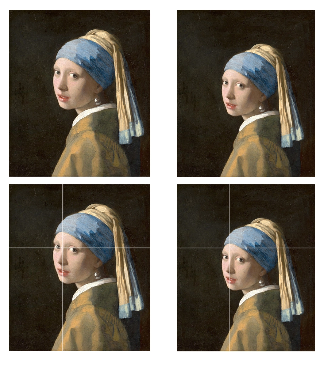
If we take a look at the gorgeous piece Girl with a Pearl Earring by Johannes Vermeer, we see that the horizontal and vertical golden mean intersect right between her eyes. Right at the focal point of the image. But, what happens if we change it slightly, so the intersection of the golden means is somewhere random, like the forehead? It still looks great. Yeah, sure, the original does look slightly better, but if Johannes Vermeer didn’t put the subject’s eyes right at the golden section, I don’t think it would be any “less great”, it would still be a masterpiece.
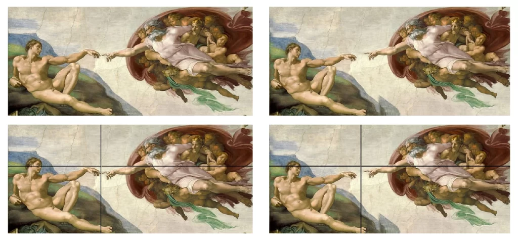
The same thing happens with Michelangelo’s The Creation of Adam. The golden ratio isn’t what makes these pieces beautiful, they are masterpieces even without it. But yes, the golden ratio does add something to these paintings, after all, it does look pleasing to the eye.
The Rule of Thirds Myth
An image doesn’t need to follow the golden ratio precisely to 1.61803, of course, that’s why the examples above look good even if we change it a little bit. And that’s why artists invented the “Rule of Thirds”, so we don’t need to measure precise mathematical ratios, we can approximate it with thirds.
But let’s see what happens when we modify an image so it doesn’t follow this rule.
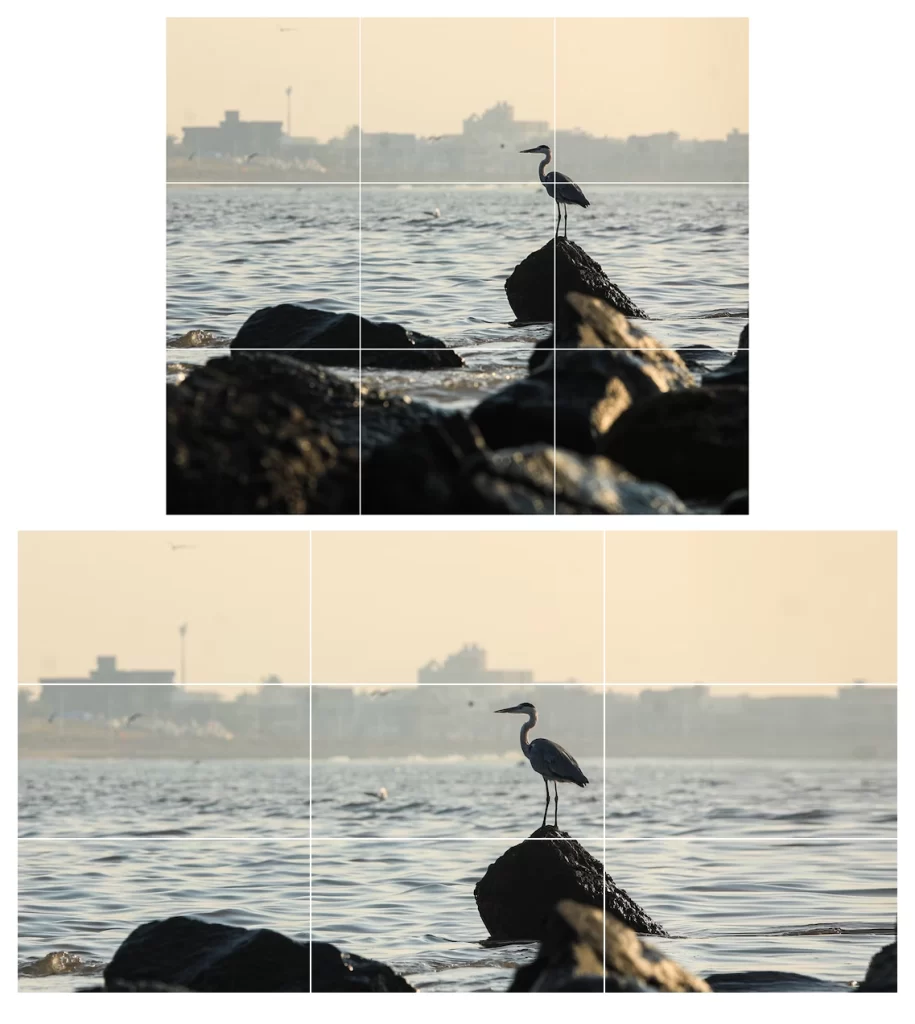
Here’s a beautiful photo from Unsplash from Harsh Raghavani and it clearly follows the rule of thirds. The bird is placed on the top right intersection, the rock is placed on the bottom left, and the line between the water and the city in the background is on the top third.
Now, I cropped this photo on the bottom, and extended it to the right, so it doesn’t apply the rule of thirds. So, does it look bad now? No! It still looks great, because it is a great photo.
The Looking Room Myth
One of the rules we hear all the time is, when we have a character in the frame, to leave some space in the direction that character is looking – looking room.
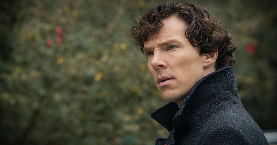
Here’s an example from the BBC’s Sherlock TV series. But what happens if we ignore that rule?

We get Mr. Robot, a show that often breaks the conventional rules of composition. Does it look bad? No, cause it utilizes other principles of composition, this shot has nice lighting, contrast, and even follows the rule of thirds, but removing the character’s looking room creates a sense of tension, which perfectly fits this show.
Is Composition a Hoax?
So, if breaking the “rules” of composition doesn’t make bad images, should we study it at all? Is there even such a thing as a bad composition? First, let’s take a look at some more images.
As you can see, there is such a thing as bad composition. Most would agree that these images look bad. Now, if we take this photo and apply the rule of thirds, it will look better, but it’s still a badly composed photo. Why?
What is it? What should we study? What makes a good composition if it’s not the golden ratio or the rule of thirds?
Well, there are some fundamental truths and principles of composition that will always work.
Origin of the golden ratio and other composition rules
Let’s start with the golden ratio. Why does it work? Where does it come from? I don’t know where exactly the idea of the golden section came from, but if you ask someone to divide a stick into two pieces in a most pleasing proportion, most of the people will choose a spot that’s not exactly in the middle, but slightly to the side, right about the third or the golden ratio. It’s an emotional decision, we just feel it’s the most beautiful way to divide something, and these compositional rules are just putting that emotional decision in a math equation.
Why do we like when a subject in a picture is placed slightly off-center? I don’t know, but here’s an interesting explanation I found on the internet.
And yeah, most composition rules come from life, something we’re used to seeing is more pleasing for us to see. The same goes for the Looking Room rule, when we talk to multiple people, we look at them, and the space in between them, and we ignore the space behind them cause it’s not important. So in art composition, if we put more space in front of a person and less space behind, it will look natural and pleasing to the eye.
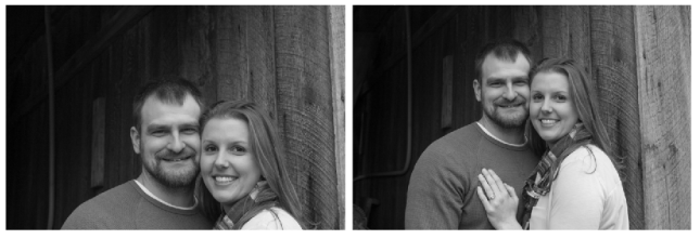
Why does the image on the right look better? Because when we look at people in real life, our eyes are on the same level, and our brow bone blocks the view above that person’s head, and nothing blocks the view below the head. So the image on the right looks more natural and has better composition.
I think we’re getting somewhere. We’re getting closer to the core principles of composition, fundamental rules that will always work. If you break these rules, your image will look bad, and if you follow them it will look good. So what are they?
The Fundamental Principles of Composition
What Looks Natural?
As we mentioned above, when composing an image, don’t focus too much on placing your subjects on the lines of thirds, or the golden section. Think about what’s natural. What is the natural way we look at that subject? When you have one character in the picture, and you place it at the edge of the frame, it’s going to look odd, because naturally when we speak with humans, we look straight at them, or at a slight angle. But for something like tall buildings, you can crop them out of the frame, because we naturally don’t see entire buildings in our field of view. When we’re walking down the street, we only see small parts of buildings, so it’s ok if you put the top of the building out of the frame in your image, we’re used to seeing it that way.
Focal Point
The focal point is the area of an image that demands the most attention. That’s your main subject. When you ask yourself “What’s the point of this image or painting?” The answer to that question is your focal point. It should be the most interesting part of the picture, having the most detail and contrast.
You can have one, two, or even more focal points, but keep in mind that the more you have, the harder it gets to compose a good image.
Focal Point Placement
Once we have our focal point, we need to place it somewhere on our canvas/frame. This is where the standard composition rules come to play. If we want our image to look pleasing, the best place to put our subject is at the golden section or the rule of thirds. That just looks the best, but as we saw earlier, we don’t need to be super precise, we just have to put our focal point slightly off-center (Of course, you can put your subject right at the center if you want to make it look powerful, especially when you utilize symmetry, it will look good.). And that decision should be an emotional one. Place your subject where it feels right, if it happens to be on the golden mean, great, if not, who cares.

Here’s a little tip, think about this white ring, usually, putting your subject somewhere inside it will do the job.
Of course, it’s important to note, that you’re not always gonna want to create a “pleasing” image. Sometimes you might place your subject somewhere unnatural, like at the edge of the frame to create a sense of tension.
Attention Grabbers
Once we placed our focal point, we need to think about attention grabbers. These are elements in the image that naturally pull our attention. And if we’re not careful, they can even overshadow our focal point, which is bad, since we want the focal point to be the main subject of our image and receive the most attention.

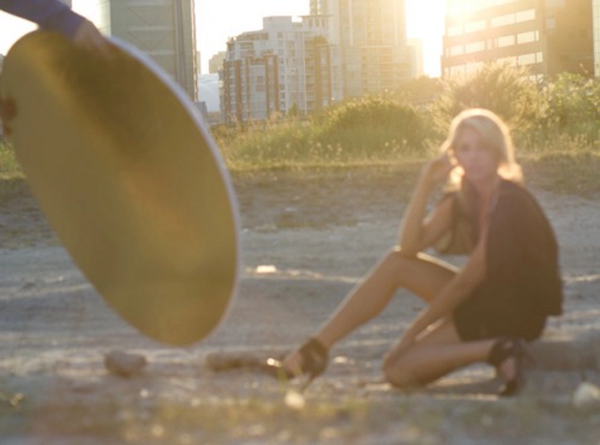
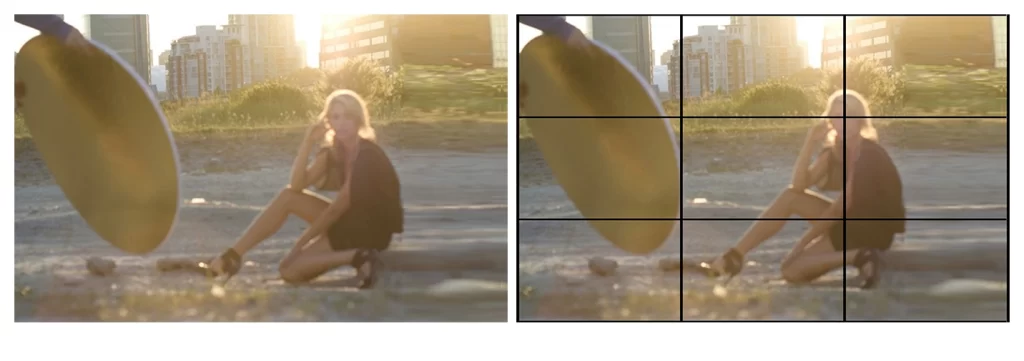
Here’s an example. When we look at this photo, we don’t know what’s the main subject. Is it the girl? Then why is there a guy holding a reflector disc in the frame? If they are the focal points, then why are they blurred? Maybe the city is the focal point? After all, that’s what’s in focus. But if so, why is the city taking such a small space in the frame?
That’s why this photo is badly composed. The viewer doesn’t know where to look at. The girl is the focal point, she should receive the most attention, she should be in focus, the city should be blurred, and the reflector disc should be off the frame. This image has too many attention grabbers that fight against each other, and it makes the image look bad.
Here’s a list of some natural attention grabbers, elements that naturally pull our attention in the image:
- Faces
- Figures
- Gaze
- Contrast
- Motion
- Detail
- Camera Focus
Faces and Figures – We are naturally drawn to people. They are important to us, and when you put a face or a figure in your image, it’s going to demand some attention.
Gaze – Imagine you’re talking to someone, and that person suddenly looks behind you. Naturally, you’re going to turn around to see what they’re looking at. It’s the same way in the picture, the viewer’s attention will go where the characters in the image look, and you can use that to your advantage when composing an image.
Contrast – Maybe the most fundamental principle of art. Contrast gets our attention. You’ve seen the examples million times. If you have 6 red chairs and one green, you’ll look at the green one, because it’s different. That contrast pulls your attention. Use it to make your focal point stand out. If the whole image is in blueish tones, and your subject wears a red shirt, it will pull the viewer’s attention. There are multiple types of contrast, contrast in value, shape, hue, saturation, detail, and so on.
Motion – This is a primal instinct of ours. When something moves, we look at it. I guess it was a useful instinct for hunting way back. When filming a movie, and you have a still scene, where suddenly something moves, we’ll look at it. But you can use the same technique in still images. Characters that are jumping, birds that are flying off, and similar, have a visual weight and will pull the viewer’s attention.
Camera Focus (or detail in paintings) – This is how our eyes work. When we look at something, it looks sharp (unless you’re shortsighted) and the background gets blurred. Cameras work the same way. So make sure your subject, the focal point is in focus. If you’re painting or drawing, just add more detail to your main subject.
When you have more than one focal point, make sure that one is the main one and receives the most attention. If you have another person in your picture, and it’s pulling the attention from the main subject, you need to tune it down. You can do it in multiple ways, putting it out of camera focus (blurring it) or decreasing the contrast (either in value, color, or detail).
You can also use other elements in the picture as attention influencers. There are two main types of them:
- Guiding Lines
- Framing
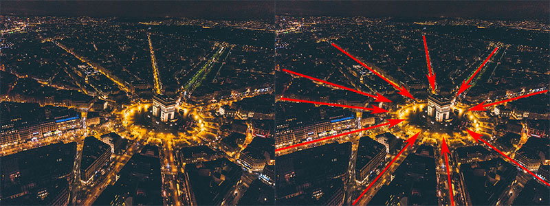
Guiding lines is the technique of using lines in the scene to guide the attention toward the main subject. Here’s an example.
And framing is a clever use of other elements (trees, doors, railings) in the image to “frame” the main subject. It’s creating a frame, within a frame.

Balance
Balance is a fairly simple concept. If on your picture you have multiple elements that draw attention, don’t put them all on one side of the image. Balance them, but keep the most attention on your main focal point by lowering the contrast on the other elements.

Conclusion
To wrap it up. Take these composition rules with a grain of salt. Make emotional decisions about it. Focus on the feeling and place your elements on the image so it “feels right”.
If you don’t have a natural “feel” for the composition and you can’t make a nice-looking picture by intuition, then study these templates like the rule of thirds. But more importantly, study the underlying truths of composition, and why images look pleasing. Think about the focal point of your picture, and what is the image about, place that element on the canvas and use all the other elements to help draw attention to the focal element. Think about attention influencers, if you can, use other elements to frame the focal point, and use guiding lines to guide the eye throughout the image, from one focal point to the others, and back to the main one.
And for the end, I wanna leave you with the only important rule of composition you should follow. It’s from Aaron Blaise.
If it looks good, it is good.
